August 19th, 2009
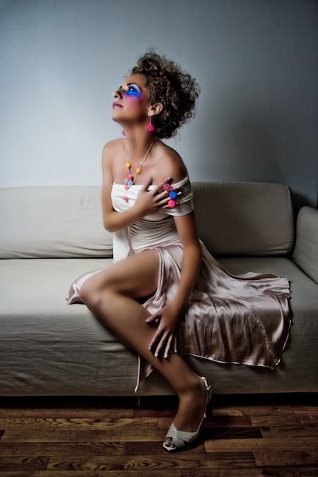
In this one I created a separate layer and used a mask to selectively saturate the colors of the jewelry and the colors around Dijana’s eyes. Using a mask allows me to alter the jewelry without modifying the other parts of the image. I also used a screen layer to lighten those parts as well.

Filed under: Photography by admin | No Comments »
August 17th, 2009
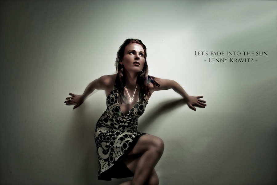
I know lens flare is cheesy, but I couldn’t resist. In Photoshop look under Filter -> Render -> Lens Flare -> awesomeness.
Note the vignetting in this picture is not a lens artifact or photoshop magic, rather it is caused by the flash, a one point light source coming from the top right. Since there is no ambient light and the shutter speed was relatively fast there’s a sharp drop off of light toward the edges.
The always beautiful Alison:

Filed under: Photography by admin | 1 Comment »
August 16th, 2009
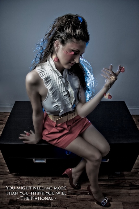
This picture is one of the first where I really went all out on every step in the hierarchy of making a professional photo from two point lighting to lots of photoshop. In addition Karen added to this hierarchy with her jewelry, selecting the clothes and William for make up (hence those crazy eye lashes).
For the geeks, here’s the two point lighting setup explained. One flash comes from the left through an umbrella set at 1/32 and 50mm. Another one with a blue gel is hidden behind Daniela to provide a very dramatic backlight. This one is really close to her so the power is way down: 1/128th and I zoomed it all the way out. The result is a nice rim light around her head highlighting her hair on the left, the top a little and most pronounced on the right.
As for photoshop one of the neat tricks I learned this time was that gaussian blurring the skin makes her skin really smooth and creates a really cool dreamy effect. I’m always learning and love experimenting with different things all at the same time. Every once in a while you get this “aha” moment where you can look back at what you learned and connect all the dots. That’s how I felt as I was creating this picture. I wanted a very graphic and highly stylized image and for this to happen I had to have dramatic lighting combined with lots of photoshop post production. It all came together in this picture.
Note I put a quote on the picture. I don’t know if it adds to the picture or if it’s just distracting. I got the idea from Dustin Diaz‘s daily pictures. Let me know what you think.

Filed under: Photography by admin | 10 Comments »
August 16th, 2009
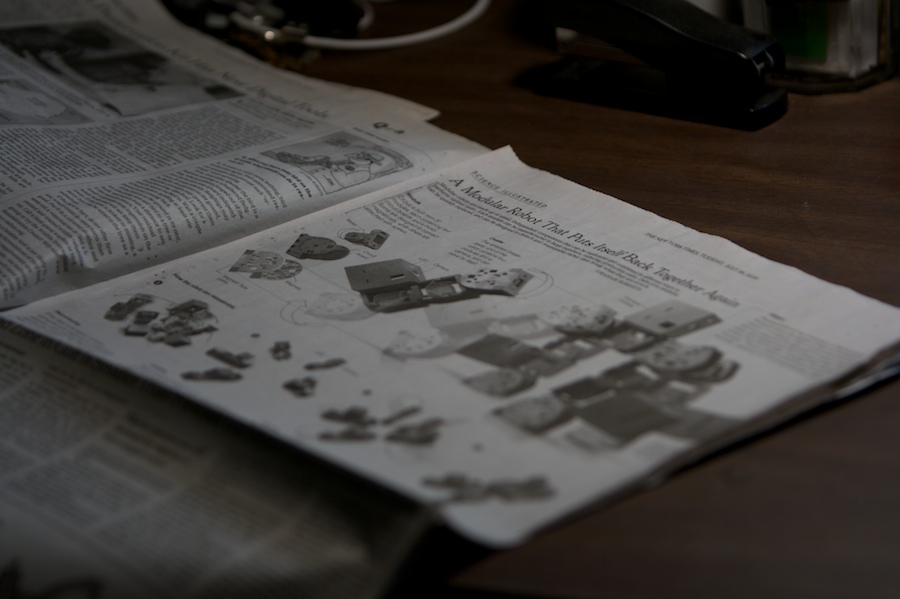
This is old news (no pun intended) but I never got the times (pun intended) to write a proper blog post about it. Anyways, CKbot got written up in the New York Times on July 28! Yes I know, that is almost three weeks ago.
My buddy from college Graham Roberts is one of the science editors at the New York Times. I’ve been pitching him CKbot stories for the past 2 years and he’s finally taken me up on it.
I got to work with him pretty closely explaining all the inner workings of CKbot, and then helping him with some of the wording. I am used to writing papers for other roboticists so it was a nice change to write to a much broader audience. With such a small amount of space and keeping in mind that readers will have a more limited knowledge of robotics, every word really counts. For the word “bump” in particular we went back and forth through a couple iterations just for that one word.
As for the graphics, I gathered all the SolidWorks files we had of CKbot and drew cad drawings of the individual module, the cluster and the dog assembly. I then converted those to Maya and sent them off to Graham. Then Graham took those 3D drawings and did the coloring, texturing, shading, posing and generally making things just look cool. Check out the reflection on the ground plane.
He went above and beyond and also made us an online interactive animation. Click here.

Filed under: Robot by admin | No Comments »
June 21st, 2009
Happier organized a post positive psychology conference happy hour. Apparently all the hot shots of positive psychology had attended this conference. I met some interesting people for example, Robert Biswas-Diener. He’s described as the “Indiana Jones of positive psychology” because he has studied subjects in remote places such as Bangladesh and Kenya.
I’ve covered a good number of happy hours now. They’re always fun because you’re shooting people and also there’s booze around (sometimes free). Nightlife though can be very tricky to shoot because of two factors. First, there’s never enough natural light so you basically have to shoot with flash. Second, there’s a lotta people to maneuver around so you have to get in close. A wide angle lens is really all you can use. Also, you obviously can’t just set up a couple flashes on top of light stands.
What I’ve found to work quite well after seeing many other photographers do the same is to hold a flash in one hand and hold the camera with the other. I like to add a small softbox to the front of the flash to diffuse the light. This way you can get very crisp pictures of people.

Keeping a low shutter speed can blur out the background while the subjects that are hit by the flash are still sharp because of the short bust of light of the flash. This can create some additional fun effects. Robert Biswas-Diene’s picture can be found in the last picture in the slideshow after the jump. Positive psychology is about being happy. I guess it’s working because everyone in the pictures has a huge smile on their face.
(more…)
Filed under: Photography by admin | 1,961 Comments »
June 21st, 2009
I had to take some headshots for an interesting startup company called Happier. Happier is a company built around positive psychology. They provide tests and exercises to measure, track and improve your happiness. It’s kinda buddhist if you ask me. They have even worked with bigger companies like google. Positive psychology has gained a lot of interest since it has been shown that people are more productive when they’re happy. Makes sense to me.
They wanted me to take some head shots of the people in the company. We met up in a room at the Sheraton and I went with a one light source type of shot. Putting the flash close up to the subject and letting it fall directly, undiffused. Hard light has kind of a bad rep in photography. I think it’s because all those point and shoots with on camera flash give of really harsh highlights on people. So when we start of as photographers using flash we often like to put a softbox in front or shoot through an umbrella to create soft diffused light. While harsh light is a little less flexible and unforgiving as small changes in position or other settings can make a big difference, it can also create some cool effects.
In this picture we get sharp lighting on the face. Letting his shadow fall on the background just adds something to the picture. The company is about increasing positive emotions and making oneself happier. This guy looks pretty happy to me.

Filed under: Photography by admin | 3 Comments »
June 7th, 2009
This Ukranian is a die hard regular at XPLR. I mean literally die hard. A couple weeks ago Pogo was rushing to class on his bike and got “doored”, broke his collar bone and now has a chunk of titanium in his left shoulder. And still this guy shows up at our photo rides.
I don’t know what he does in photoshop or with his camera but his photos always come out with beautiful colors. They are out-of-this-world good! See for yourself at www.photoetic.com.
In the photo below, the blue light from the windows on the right and a flash from the left makes for very dramatic shadows and separates Pogo from the background.
I particularly like this portrait of Pogo (Evgeny Pogorelov) because much of his style and aesthetic is about interesting color. I like to think this picture with the contrast in light and dark and in particular with the difference in colour of the two light sources hints at his approach to photography. It’s quite fun, perhaps a little ironic, photographing other photographers.

Strobist info:
A Canon flash 430EX handheld from the left zoomed all the way in, no gel. Power at 1/32? I forget. A natural softbox is provided by the blue tinted windows.
Filed under: Photography by admin | No Comments »
June 6th, 2009
One part I love about photography is that it gives you license to meet some very interesting people you would otherwise not approach. This weekend the Penn Alumni Club spent a morning with the elderly at Casa Farnese, a home for assisted living, by bringing spring cheer with gifts and conversation. I helped out with some photography.
What’s great about taking someone’s portrait is that it lets you get to know someone in a different way. It changes the way you look at them and it also changes the way you interact with them. It’s hard to describe. I guess it slows things down and forces you to really look at someone’s face and in their eyes. I think JJ Tiziou said it best: “Every person I take a picture of, for a split second, I fall in love.”
However, multi-tasking to maintain a conversation with someone and manning your camera at the same time can be harder than you think, especially if you don’t have a lot of time. Taking a good picture is difficult enough. I have yet to find a good solution on how to split my brain in two. I guess you just gotta get to know your chops inside out so you can spend less time thinking about lighting and more time talking and listening to the person in front of you.
I wasted the first 15 minutes not getting anywhere with my flash when I realized the natural light was actually really good. Silly me always making things more complicated than they really are. Light came from left through a window. It was cloudy that day so light was diffused and not casting any harsh shadows. Perfect.
This is Helen Shmidt. It was a pleasure taking her picture.

(more…)
Filed under: Photography by admin | 7 Comments »
May 11th, 2009
I covered the Penn Alumni Club happy hour at the Devil’s Alley today. The event was a welcome to the new alumna (recent graduates of 2009). This restaurant is a great photo opp with lots of wood, big plants, a couple windows in the ceiling and a huge window in the front.
I particularly like the picture below. I zoomed my flash all the way in, creating a smaller more concentrated cone of light coming in from the left top. This allowed me to lower the power quite a bit, perhaps 1/64, I forget. The light falls on Enrique and Lex perfectly, highlighting their beautiful smiles, while leaving the background a tad bit underexposed. The waiter in the left back is highlighted by daylight seeping in through a window in the ceiling above and adds some depth to the picture. Sometimes all the moons (light sources) align and provide the right highlights and dramatic shadows in the right places and alls I gotta do is push the button. Other times the light falls in dull and uniform, and I bring out my flash and deliberately control the light myself. In some cases, a bit of both is happening as is the case in this picture.

More pictures of the happy hour after the break.
(more…)
Filed under: Photography by admin | 1 Comment »
May 8th, 2009
I got to shoot a happy hour for the Penn Alumni Club. It was held at Table 31, which is a cool outdoor bar in front of the new Comcast building here in Philadelphia. The event started at 6PM which was at exactly the right time for me as sunset always gives nice lighting. Some weird stuff happening though with the orange umbrellas reflecting off and casting an orange glow onto everyone. Nevertheless I didn’t gel my flash and I think the colors came out right. They wanted “professional party pics”. So usually this means a lot of group shots of people with drinks in their hands posing for the camera. But it turned out to be a very lazy sunny afternoon and I tried to capture this laid back atmosphere.

More pictures after the jump.
(more…)
Filed under: Photography by admin | 39 Comments »
